
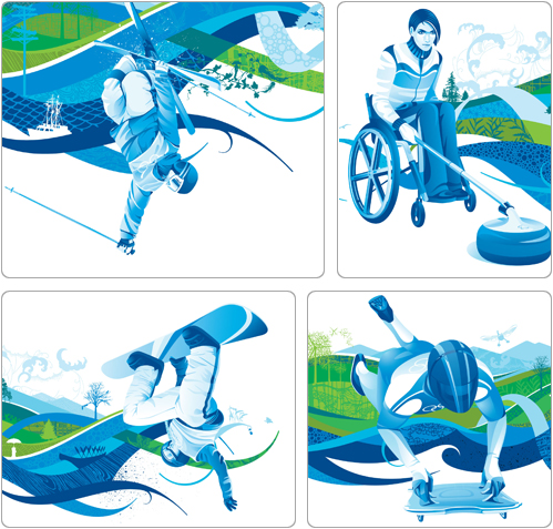
Andy and I aren’t really into sports. Even the Olympics, the be all end all of sports. However, every Olympics season each host city brings different branding and graphics to the games. While the 5 ringed Olympic logo remains consistent, it’s fun to see how graphic identity changes from city to city. Below is how Vancouver chose to treat their branding of the games. I think the colors really speak of the connection the city has to nature, wilderness, the mountains and water. The feeling of movement is just phenomenal and the images feel very modern and progressive. All good attributes you want associated with your city.
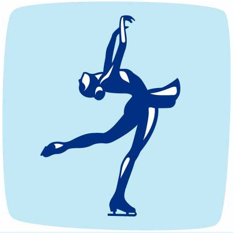
The event pictograms are my favorite images to look for. The games bring together competitors from different countries who speak dozens of languages and in 1964 a system of pictograms was created to visually represent events to help break down this language barrier. Signs and banners with these images help direct individuals to correct events.
Check out the evolution of Olympic pictograms.
I really enjoy the organic shapes created for the Vancouver 2010 games:
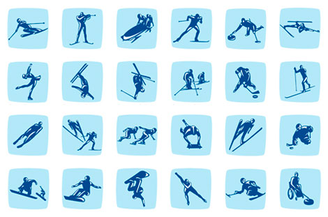
View larger pictograms here.
Images taken from vancouver2010.com